Espoo Museum of Modern Art
On Parking by Elmgreen & Dragset

Autumn 2020. We are set to transform Finland’s Espoo Museum of Modern Art, EMMA, into a car park. The idea of doing so had come to us about a year earlier. It was not our first concept for our scheduled exhibition there, but when this idea arrived, it quickly pushed everything else aside and settled in as if it had been there from the very start.
By Elmgreen & Dragset
It had its own logic which went beyond the obvious spatial similarities between the brutalist concrete interior of EMMA and the no-frills utilitarian architecture of a classic car park, which we will get back to later in this text. The vast, bare space seemed to be a natural place to park ideas that had circulated in our work for a long time. We have often conflated gallery and museum spaces with other sorts of institutional or civic spaces – transformed the minimal design features of the so called white cube into environments closer to our everyday reality, such as an underground station, a hospital ward, an airport, an abandoned public swimming pool, or a domestic setting. The spatial transformation can trigger a moment of surprise, an experience of alienation by the viewer, which has the potential to sharpen the viewer’s perception. However, dressing up the gallery space “in drag” can also create a more direct familiarity since the space suddenly can remind us of other less “arty” contexts from our everyday lives. People that have followed our practice over the years are familiar with this approach.
What is lesser known and has – until now – even slipped past our own radar somehow, is the relatively frequent use of cars in our art works. Why cars? The sociologist Karen Lumsden has pointed out the absurdity of the lack of social science around cars, considering there are almost 1.5 billion of them in the world. “The role of the automobile is shaping landscapes, social relations, gender roles, everyday routines and urban life”, Lumsden writes. “Traffic largely dictates the design of space – both urban and rural – thus structures and defines our experience of, and negotiations through, everyday life” (Lumsden, Karen, Boy Racer Culture: Youth Masculinity and Deviance, Routledge, 2013, pp. 10 – 11).
We have never perceived ourselves as “car freaks”. We currently lease a pick-up truck that we share with our studio and another Berlin artist, and it’s not in daily use or of any great importance in our lives. That being said, Michael knows everything about cars. Models, engines, cylinders, horsepower, acceleration… He’s had an obsession with cars since childhood. The only problem is that he doesn’t drive. But that never diminished Michael’s adolescent infatuation with cars as design objects, so whenever there has been a motor vehicle involved in any of our art projects, he has happily taken the reigns in the process of selecting the right model. He would consider the design and tech specifications as well as what that particular car brand would signal socio-culturally at that particular time in history, the brand and the specific model’s symbolic value in relation to class, taste and norms and what a certain car can tell us about our visions for the future at that given point. More than most other design objects, cars can reveal a lot about the power structures in our society. In the following pages we look back at some of our own “automobile work” in more or less chronological order and shine the headlights on some of the sociological and anthropological factors that have influenced us. From tracing the development of the car motif throughout our oeuvre, we hope to give a wider understanding of our project at Espoo Museum of Modern Art, entitled 2020.
Parking in the Living Room
The first time a car appeared in one of our projects was in 2004 when we had been invited by Massimiliano Gioni, the artistic director of the Nicola Trussardi Foundation in Milan, to create a temporary work for Galleria Vittorio Emanuele II. The Galleria is a grand and ornate cruciform shopping arcade built between 1865 and 1877 and named after the first king of the newly united Italy.
At the beginning of the 2000s the people of Milan still called the Galleria by its historical nickname: “Il Salotto di Milano” – the “living room” of Milan. But like everywhere else in the world, realities had shifted. Apparently, all the way up to the 1980s, the restaurants of the galleria were still upscale, and it is rumoured that the decadent twist of serving Risotto alla Milanese – the famed saffron rice risotto topped with gold leaf – was invented there. By 2004, McDonald’s had moved in and the glamour was fading. The optimism of the past was gone. But the physical symbols of former power and opulence embedded in the architecture were there to stay.
However, all antiquated symbols of power need to be reassessed, challenged in order to be repurposed, or we’re in danger of perpetuating ignorance, cultural amnesia and regression. To us, Galleria Vittorio Emanuele II seemed to need such a shake-up.
In principle, the arcades of the Galleria are wide enough to drive through, but they are of course fully pedestrianised. Could one imagine a car parked there? We felt that even though people seemed to park anywhere in Milan in general, bumper to bumper, people might still stop in their tracks if a car stood parked in the middle of the Galleria, smack in the middle of the city’s “living room”. Or what if a car in a more violent, surreal gesture were to break through the precious tile flooring of the arcade, towing after it a camping caravan? A caravan can be seen as another kind of living room, and possibly the direct architectural antipode to the grandeur of the Galleria; a symbol of cheap holidaymaking in the midst of the posh shopping mall.
With the various and sometimes discrepant associations to cars, caravans and camping in mind, we set out to make a sculpture for the central piazza of the Galleria incorporating exactly these elements, but which would be more than just an easily dismissed disruption. Based on Michael’s automotive knowledge, the choice of car fell rather quickly on a Fiat Punto. Fiat is an Italian brand and Punto was at that time considered the last really successful model since the carmaker’s 500 model. We searched for a caravan that was not too old, not too new, and that fit the picture of a caravan that a child would draw rather than represent any current model in vogue. As so often when working with the iconography of a certain object, we could not find the perfect one, and had to construct parts and alter an older model that was closest to our shared imagination of it.
We wanted to create a moment of wonder at the heart of Milan by making it look as if the car had burst through the mosaic floor from beneath the ground at high speed, dragging the caravan behind it. As if frozen in time, the sculpture stood immobile and abandoned in the midst of scattered soil and debris – a foreign object that feigned destruction of the historical surface it had just penetrated.
Some people did get upset with the perceived damage to the floor, not realising that a trompe l’oeil effect was obtained by diagonally cutting off the back of the caravan so it seemed that the bottom part was still buried underground. We had worked with professional Italian mosaic restorers to recreate parts of the historic patterns of the floor, then broken them into jagged fragments and strewn them around the protruding caravan. The apparent destruction was what really got the blood boiling in some circles, especially amongst local members of the far-right party, Lega Nord (The Northern League). They claimed that we had disrespected Italian culture and history; firstly, by covering up and possibly destroying the royal insignia at the centre of the floor, and secondly by making fun of Italian driving skills(!). We called the piece Short Cut.
Short Cut temporarily became a meeting point for the Milanese, and a backdrop for everything from dance performances to wedding photos. Meanwhile, two members of Lega Nord decided to make a daily protest in front of the work, by setting up a round table draped in a red and white chequered tablecloth, on which they would share a pizza and have a glass of red wine until they were inevitably removed by the police, having obtained no permission for their protest.
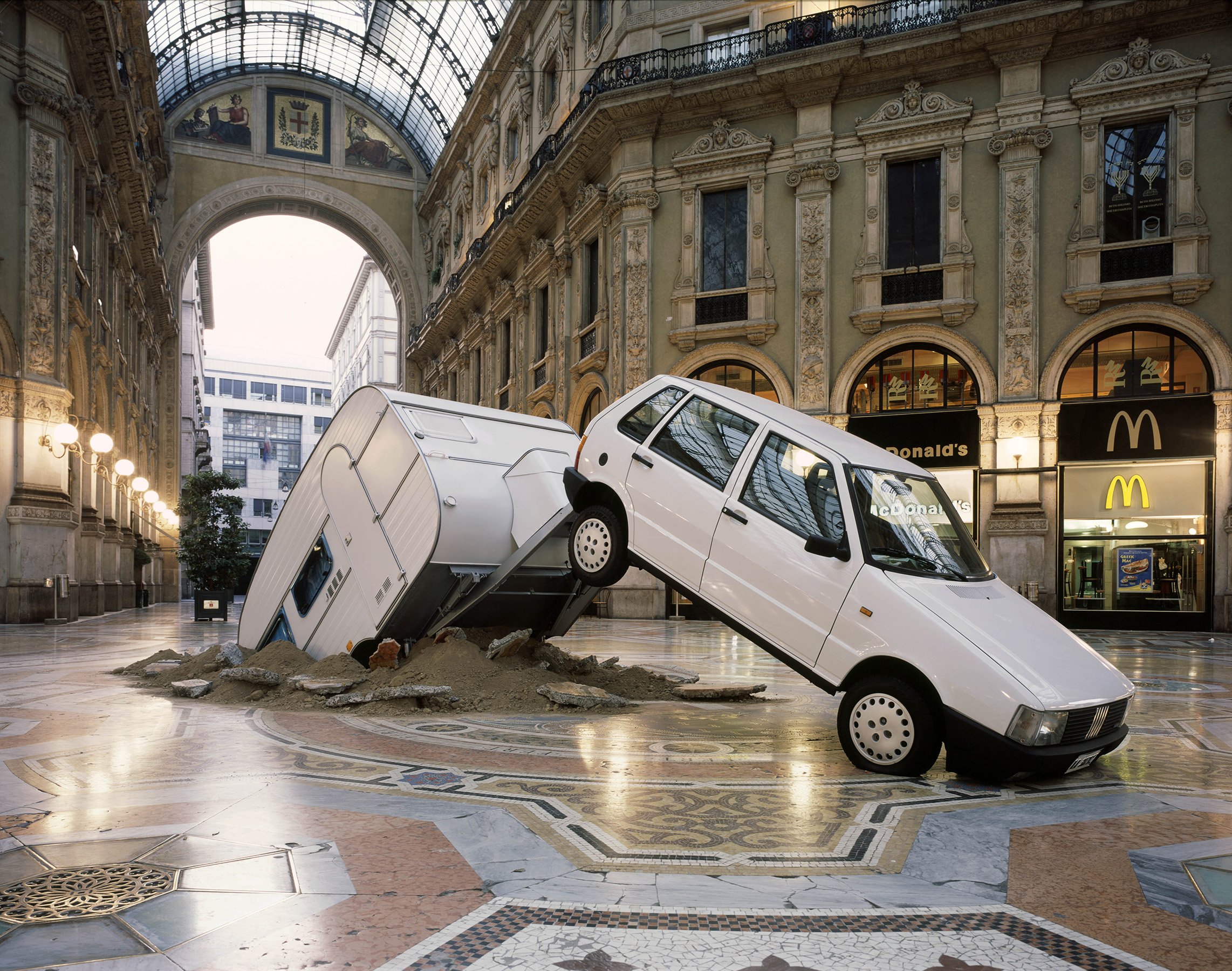
Elmgreen & Dragset: Short Cut, 2003 © Jens Ziehe. Courtesy of Galleria Massimo De Carlo; Museum of Contemporary Art Chicago Collection.
Room for More
Our next art project in a public space was an invisible car park. This happened in a place very different from Milan, namely Tranøy, a tiny, remote hamlet on the north-western coast of Norway. It had once been an important, if small, outpost of the Norwegian coastal authorities, and has later taken pride in the fact that the Nobel Prize winning writer Knut Hamsun had worked in the local shop as a fourteen-year old boy back in 1874. Only about a dozen households remained in 2005. Having been invited by Arts Council Norway to present an artwork especially for this community, we were invited to meet with all the villagers, first to learn about the place, and later to present our ideas.
Our first proposal of giving each household in the village a puppy, all of the same breed, met enthusiasm with some, but others were concerned; some had a cat already or allergies, and a dog might make commuting difficult. So, we went back to the drawing board. We loved the close communication with the locals, the fact that we could meet every member of the community. Tranøy felt very special, with its vast and beautiful, if sometimes inhospitable surroundings, and its small, cheerful and exceptionally hospitable population. We wanted our work to reflect the uniqueness of the place.
A few months after our first visit, we went back and presented the idea of constructing a large street sign along the main entryway into the village, which would announce a parking garage ahead. The sign itself looked typical of those found both in Norway and elsewhere and featured a white letter P with a roof graphic above it against a bold blue background. An integrated electronic number display would show the number of available parking spaces, but the numbers would only change between 285, 286 and 287 – at random intervals. The street sign would announce something that didn’t exist, and in the name of nature preservation hopefully never will exist in Tranøy. The locals immediately embraced the absurdity of the sign as we presented the renderings of it, but it was when we conveyed the title of the work that it really struck a chord with the local residents: “Tid till mer, plass till fler” which translates into something like “Time for more, room for more”. Together with the commissioning organisation the decision was made to install the sign as a permanent sculpture welcoming visitors to the village. Fifteen years later, there is still as much free parking as ever in Tranøy. If you’re tempted to go and search for the best route there on Google Maps, you’ll probably get the pop-up message “Can’t find a way there. Try again”, as we do from our base in Berlin. But we can tell you that it is a beautiful 3.5-hour drive from the nearest airport of the City of Bodø.
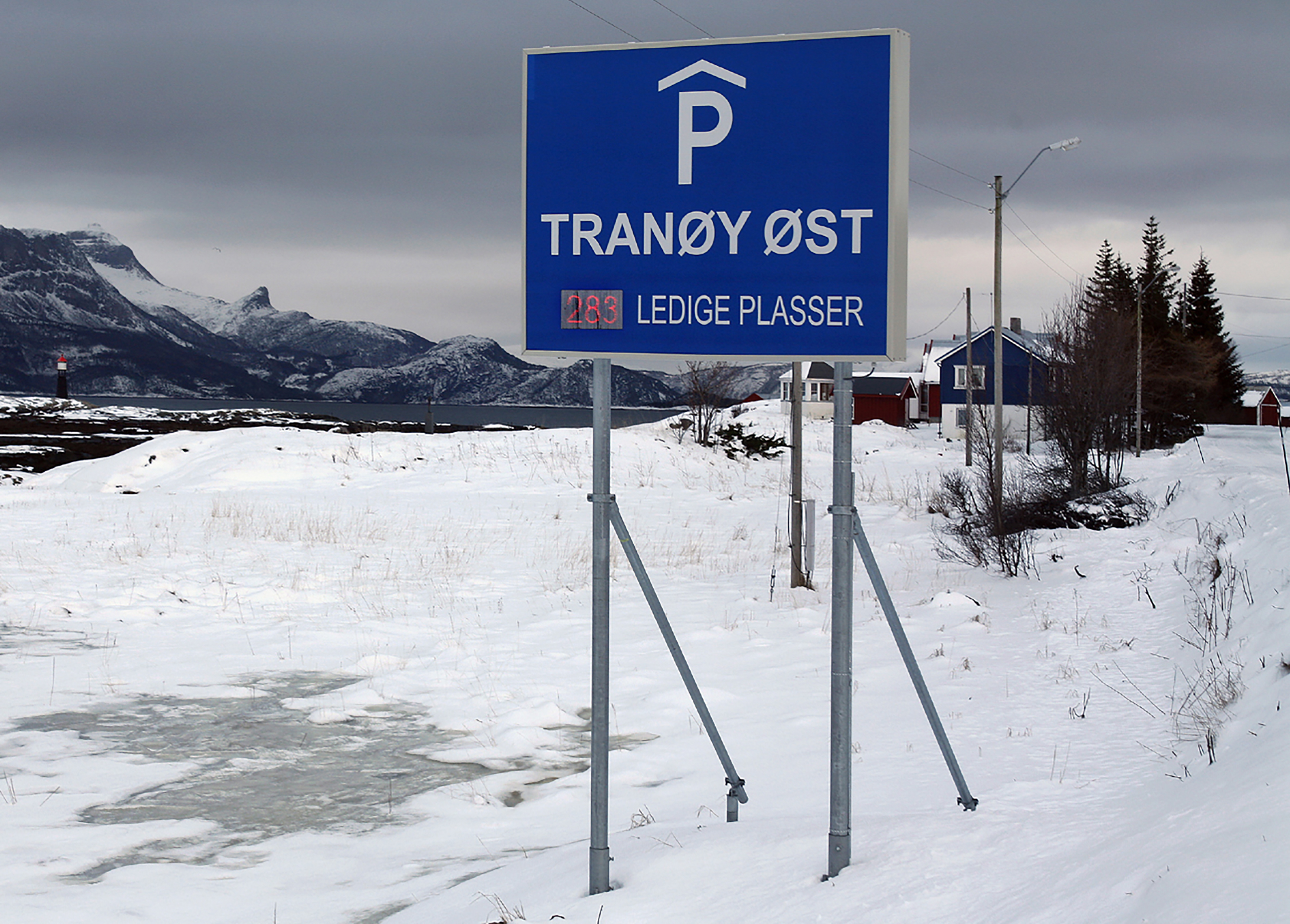
Elmgreen & Dragset: Tid till mer, plass till fler, 2005 © Studio Elmgreen & Dragset. Courtesy of the artists.
Parking in Front of the Wrong Gallery
Unlike Tranøy, New York is a place where both space and time seem to be a constant scarcity. With a little help from our friends running The Wrong Gallery in Chelsea though, we did find a parking space for a hip, new Mini Cooper back in 2005, right in front of the gallery door. “Door” being the operative word here, because that is almost all the gallery was, a miniature glass door in the scale of 1:6, leading to, well, nowhere really, just a tiny foot-deep space behind it. The project was initiated by Ali Subotnick, Massimiliano Gioni and Maurizio Cattelan, who received permission to embed the small door into the façade of Andrew Kreps Gallery on 22nd Street. They ran The Wrong Gallery from 2002 to 2005, inviting artists from all over the world to do small projects there. Following an invitation from the trio to present an idea for a show, we found inspiration in The Wrong Gallery’s own inherent questioning of Chelsea as a hub for big galleries catering only to a certain high-powered bracket of the art market. We ended up leaving the little gallery space itself empty and parked the rented Mini Cooper in front of it. It was full of shopping bags from posh downtown boutiques, and there were receipts strewn on the floor, mixed with gallery guides and invitation cards for private views of exhibitions. Most crucially, though, there was a realistic looking wax baby left sleeping in a carry cot on the back seat. Some parent had seemingly been in a rush to get to the right gallery on time and forgot the baby in the excitement of gallery-hopping.
A couple of days after returning home to Berlin from New York, we received an agitated phone call from the staff at Andrew Kreps Gallery. They had just witnessed three NYPD police officers breaking into the car, “saving” the baby after being alerted by members of the public. They managed to snap three grainy photos of the event, but these do not show the faces of the policemen, who became increasingly upset when they discovered the baby was only made of wax. And it didn’t help that staff from Kreps’ gallery tried to explain that this was an art project related to the miniature gallery door. Both baby and car were confiscated, and The Wrong Gallery returned to “business as usual”. There were no miniature staff, and therefore nobody to charge for the offence.

Elmgreen & Dragset: Forgotten Baby, 2005. © Studio Elmgreen & Dragset. Courtesy: Galleri Nicolai Wallner
Disgrace
If the Mini Cooper (Forgotten Baby, 2005), became a symbol of careless parenting, a 1982 model of the luxury Rolls Royce Cornice became our choice of car to symbolise indecent wealth and tax avoidance. For that, it was a car that had to be symbolically punished. For our first solo show in Miami in 2006, we covered one in tar and feathers. At that time – before gentrification had set in – one literally had to zig-zag between homeless people in Miami’s design district to enter a private collection or a gallery, only to find oneself in a fairy-tale world of insular glamour. Coinciding with Art Basel Miami Beach in December that year, we made an exhibition called Disgrace at Galerie Perrotin. It consisted mainly of a life-cast gilded bronze maid named Rosa (2006), and the work that gave name to the exhibition, the Rolls Royce car we had tarred and then covered in feathers. The symbolic castigation mimicked the tarring and feathering of thieves in the nineteenth century, often executed by groups of people without official authority. The Rolls Royce Corniche was slowly spinning round and round in the exhibition, like a car on display in a show room or at an automobile fair, but in its ridiculous outfit – white feathers clinging to the black tar – the car looked more like a vision of purgatory than a precious investment object.
There was a second layer, so to speak, to the choice of using tar. Tar can be made from coal or petroleum, two forms of polluting fuel impacting the environment like gasoline or diesel. By covering the car in a material which essentially relates to oil, to the material that would make the car move, becoming a vehicle of velocity, we aimed for a double whammy. We saw a double perversity to this action that not only brought to mind unfair distribution of wealth, elitism and snobbery, but also the common acceptance of the overuse of fossil fuels that are harmful to the planet and to animal and human life.
A second version of Disgrace was later shown in Russia, at the 4th Moscow Biennial (2011), in another city, in another oil rich country, with enormous social disparity.
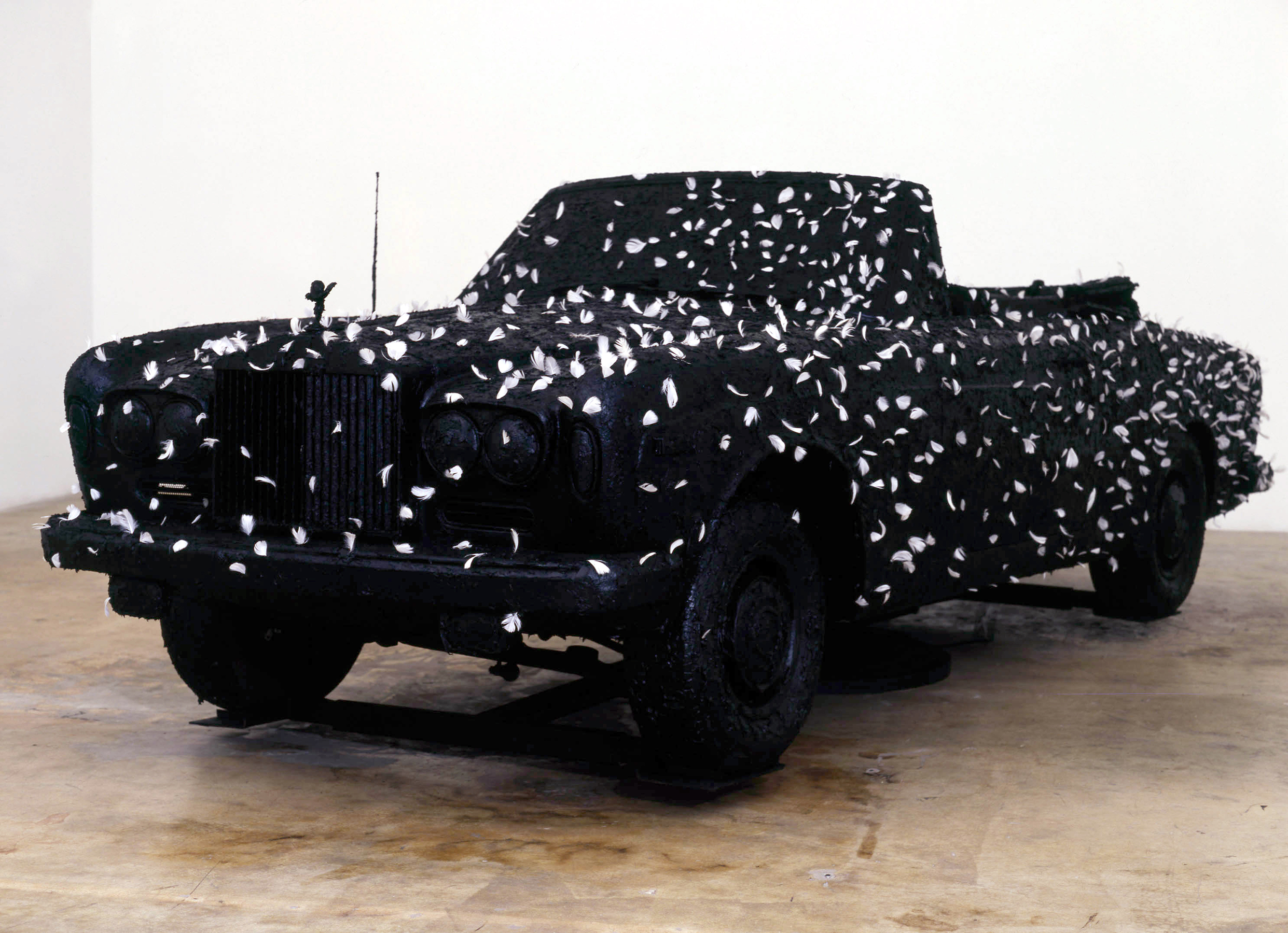
Elmgreen & Dragset: Disgrace, 2006. Courtesy: Galerie Perrotin. Photo by: Mariano Peuser
Stretched Limo
After Disgrace, it took until 2010 for our next car themed work to materialise. This time we created a parking lot in the harbour of Rotterdam, although there was a larger narrative context to it. Museum Boijmans van Beuningen had given us the opportunity to make a project we were to call The One and the Many (2010) in the humongous submarine wharf that they used to program art projects in each summer. There we built a thirty-meter long pedestrian tunnel in corrugated metal that led from the entrance of the wharf into what we made look like a suburban social housing area and simulated a state of permanent night by covering the skylights. The centre piece was a four-storey apartment building, surrounded by a small park with benches, a fairground attraction, streetlamps, a public toilet and of course, said parking lot. We worked with a local youth theatre group to develop characters that could realistically be found in environments such as these. Whereas a couple of young male performers were seemingly soliciting around the toilet cubicles, others were hanging out in the parking lot, trying to fix an old, battered stretch limo raised off the ground with bricks where the tyres should have been.
For Europeans, the stretch limo was for decades associated with American pop culture, tackiness and decadence. By the late 1990s or even the 2000s, the car could be found more commonly on European streets and was increasingly associated with flashy hen-dos and graduation parties, having reached a new type of consumer: the not-so-wealthy living the fantasy of a glamorous life just for a night. The boys trying to fix the stretch limo were left to tinker with a symbol of a dream that wasn’t even their own, but one borrowed from the entertainment industry. Like so many of our dreams.
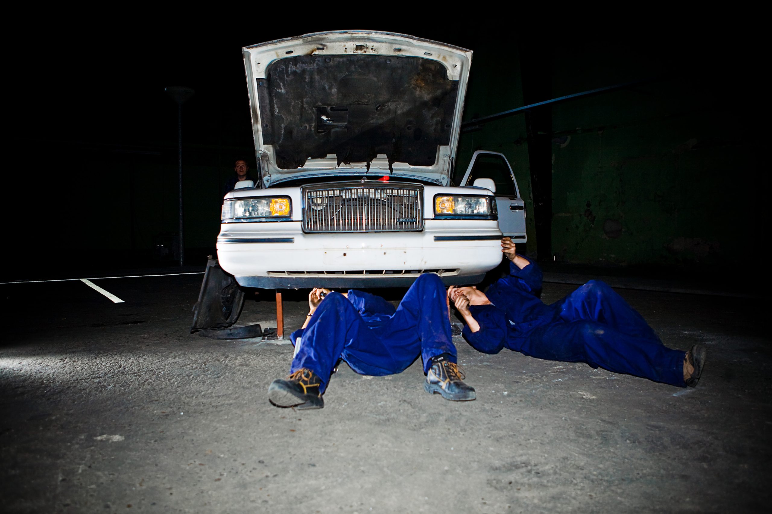
Elmgreen & Dragset: The One & The Many, 2011 © Tot en met ontwerpen. Courtesy: the artists; Museum Boijmans Van Beuningen.
The New Neighbour’s Car
When not broken, cars are for leaving and for arriving. For our project Die Zugezogenen (The Newcomers, 2017) at Haus Lange in Karlsruhe, we parked a car by the porch in front of the building, packed heavy with suitcases, a mattress and other domestic items in the boot and on the roof rack. A “For Sale” sign on the front lawn, covered with a strip saying “SOLD”, further hinted at somebody new moving into the house.
Haus Lange was designed by Mies van der Rohe at the end of the 1920s for a wealthy textile business family but had been active gallery spaces under the umbrella of Kunstmuseen Krefeld since 1955. Had the museum, or the city council, now sold the famed villa? To whom?
The car in front of the building could be a clue; an older, golden metallic Jaguar with British number plates, and a GB sticker on its back. Brits? Moving to Karlsruhe? A large article we commissioned for the Westdeutsche Zeitung – Krefeld’s main newspaper – would “explain”: following the recent vote for the UK to leave the EU, masses of expat Germans had decided to leave Britain and return to Germany. Karlsruhe, centrally located in the Ruhr district seemed to be a favoured destination for those returning to their home country. Karslruhe, a once prosperous city now in slow decline, was relatively inexpensive compared to nearby Düsseldorf or Cologne. Quotes from various key Karlsruhe residents revealed the concerns of a society faced with any kind of change, especially instigated from the outside, although the mayor and a local real estate agent were voices of optimism on the subject of local growth. The article was accompanied by a picture of British cars stuck in an endless traffic jam on a multi-lane German Autobahn. There was also an interview with the family that was moving into Haus Lange, speaking about their expectations and concerns associated with moving back; how happy they were return to their “Vaterland” (homeland) and move into such a remarkable historical building. The article, however, also described how they planned to transform the flat lawn area behind Haus Lange into an English garden.
Even though the newspaper had announced on its front page that the double spread article was part of an art project, the reactions were so strong and numerous that the newspaper had to man an extra telephone line to manage the callers. A public building sold to private a private family? A landmark building lost, possibly ruined? Who are these people? Many came to Haus Lange to see for themselves what the hullabaloo was about. Passing the weighed down, slightly run-down looking Jaguar, with a Fortnum & Mason hamper and a Victorian rocking horse still on its roof, on the way into what was actually an exhibition, they entered a home in the process of being re-painted and furnished. Somewhat temporarily placed, a mismatch of mid-century, middle-European furniture and British artefacts, personal items and art works pointed to both a personal story and one of Europe in transformation. Change is not driving away any time soon, it might arrive and park right outside your door. The world is not what it was before. It never was, so what are we afraid of? Possibly, ourselves.
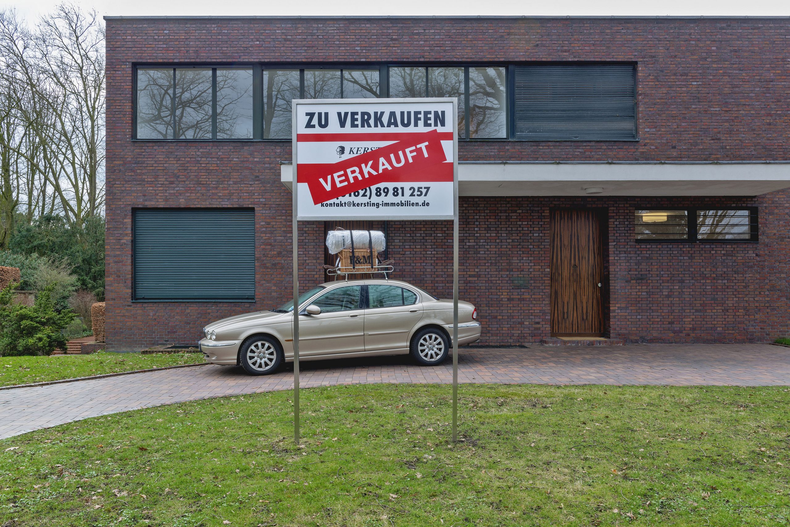
Elmgreen & Dragset: Die Zugezogenen (installation view), 2017. Museum Haus Lange, Kunstmuseen Krefeld. © Volker Döhne. Courtesy: Museum Haus Lange, Kunstmuseen Krefeld
The Car Without A Body
Over the years, throughout our collaboration, we’ve made about half a dozen works that use or involve car-parts such as a tyre, a car seat, or a rear-view mirror.
Papa Was a Rodeo (2014), whose title was taken from a Magnetic Fields song, is a sculpture of a little boy lying on his back inside a large, upright truck or tractor tyre with a pensive, dreamy look on his face. His body is framed by the tyre, but whatever symbolic qualities the wheel can have in terms of life-cycles and movement, we like to think that the boy’s thoughts are expanding beyond the frame that surrounds him. Growing up in a rural or a small place with a high level of social control can be challenging if you feel different from the majority. This sense of isolation might have decreased post internet and social media, but kids still have to deal with a day-to-day reality which can be hard to navigate. If you’re a boy and not interested in cars, speed and danger, you still might be faced with the scorn of fellow classmates who have adopted generations-old ideas of what masculinity entails. Is the boy inside the wheel hiding himself and his thoughts within the perceived safety of a masculine structure? Who is he dreaming of becoming?
We might subconsciously have had the boy’s adult self in mind when we created the work After Francis Bacon later in the same year (2014). In this sculpture, the upright tractor tyre is larger than the one we used for Papa Was A Rodeo and the human figure is gone, replaced with grease-stained worker’s overalls. The overalls are slung across the front of the tyre creating the outline of a spread-eagled body. It’s our own twist on the figure in Leonardo da Vinci’s drawing The Vitruvian Man (1487) where he depicted the ideal human body proportions. Is the ideal man today post labour? Ideal man or not, the overall shape reminds us of images of crucifixion and suffering. Francis Bacon painted several pictures of his life-time companion John Edwards partly framed by circles and squares, potentially idealised, but he is better known as an artist who, through his imagery, incarnated the suffering of man. He was interested in the crucifixion of Christ not as a religious symbol, but rather as proof of the cruelty humans are capable of and its emotional aftermath.
In After Francis Bacon, we wanted to use the wheel as symbol of perpetual suffering. But as there’s no real body in the overalls, or to use a Deleuzian term, there’s a “body without organs”, we also speak of a potential liberation of the self. Deleuze and Guattari continued to develop the meaning of “body without organs” over the years (from Capitalism and Schizophrenia to Anti-Oedipus and A Thousand Plateaus), but initially Deleuze founded the term based on a paragraph in Antoine Artaud’s radio play To Have Done with the Judgment of God (1947):
When you will have made him a body without organs,
then you will have delivered him from all his automatic reactions
and restored him to his true freedom.
Freedom. “Freedom’s just another word for nothing else to lose,” sang Janis Joplin in Me and Bobby McGee (1969). In another famous song, with her own lyrics inspired by the Beat poet Michael McClure, she also sang:
Oh Lord, won’t you buy me a Mercedes Benz?
My friends all drive Porsches, I must make amends…
Absurdity appealed to Joplin, and she introduced the song with irony and humour when she went live with it, saying “I’d like to do a song of great social and political import. It goes like this…”. Still, Mercedes Benz went on to become a hymn for anti-capitalism, critical as it was of an increasingly competitive society focused on material goods. (Little could she know that things would get absurd for real, as the song went on to be used in Mercedes-Benz’ own adverts twenty-five years after she passed away.)
Mercedes Benz is the song we refer to in the work I Must Make Amends (2018). The sculpture is a patinated bronze cast of a Mercedes-AMG car seat. It looks realistic, leathery, sportscar-like, but it’s heavy and immobile. It’s an amputated autobody part, obsolete, cast away and left useless on the floor, like trash. By casting it in bronze – a durable, valued material – we wanted to propose a perverted memorial to a time long gone, one of naïve optimism and geared-up masculinity. It has also made its way into our car park in Finland…
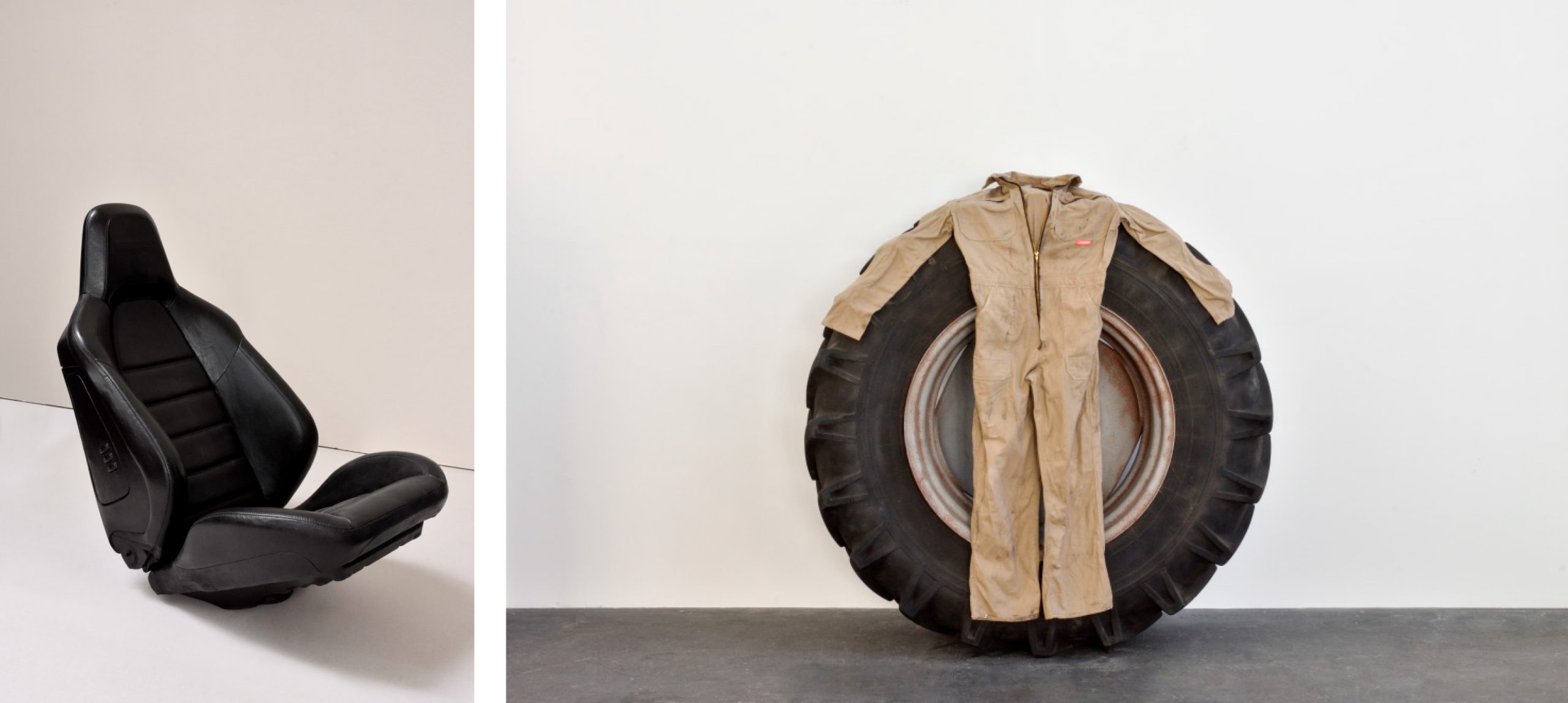
Left: Elmgreen & Dragset: I must make amends, Fig. 1, 2018. Courtesy: Massimo De Carlo Gallery Right: Elmgreen & Dragset: After Francis Bacon, 2014. Courtesy: the artists © Elmar Vestner
Car Park Lore
The idea of transforming EMMA into a car park initially emerged from studying the architecture of the museum space, first the interior: it’s expansive floor plan, rounded columns and exposed raw concrete surfaces were all details that lend themselves to the vision of a parking garage. The façade of the building also seemed to support the idea of parking facilities existing inside, as it is grey, wide, rectilinear, and completely un-ornamented apart from the artfully engineered beam structures protruding through the roof. The art spaces are all on the second floor, initially constructed as one vast area that used to hold rows and rows of printing machines back in the day. On the long sides of the building there are floor-to-ceiling windows that provide uninterrupted views to the surrounding landscape.
The brutalist style of the Espoo museum made us think of the countless generic looking concrete car parks we’ve encountered over the years, but also more elaborate ones. One that seemed particularly relevant, was another 1960s signature brutalist building, namely the Trinity Square car park in Gateshead, UK, designed by Rodney Gordon with Owen Luder Partnership. As with so many brutalist buildings (The South Bank Centre in London amongst them), Trinity Square created a lot of debate when it was completed in 1967, and also around its demolition which started in 2010. It remains in popular imagination due to its prominent role in the film classic Get Carter (1971), starring Michael Caine as a gangster throwing another crook over the edge of an upper level, killing him. For many, the car park was a masterpiece, even though it was never in full use and apparently the untreated concrete had started to stain already by the time Get Carter was filmed.
Trinity Square was probably not chosen as a movie location for its architectural innovativeness, but rather for its implicit harshness – to a general audience it would come across as a dystopian environment. A car park often feels like a strange, even inhumane place. Like a public space without a public, where nobody wants to be. It is not meant for human interaction, but for the storage of our machines. Get Carter is not the only film to feature car parks as settings for characters’ more or less illegitimate behaviour. There are endless car chases in parking garages in both action movies and TV series, particularly from the 1970s. Often, exchanges of drugs, guns and secrets happen in these bleak cavernous spaces. From Dirty Harry to Robocop, James Bond to All the President’s Men– they’ve all included special moments set in car parks. Parking garages seem to correspond to a darker place in the human psyche.
But that’s not always the case. In the publication The Architecture of Parking (2007), Simon Henley goes through the history of the parking garage, from its infancy to its fairly recent re-emergence as a space of innovation and integration within other urban functions. One of many noteworthy arguments that he brings forward is that the parking garage – however purposeful and accommodating it needs to be in its basic structure – has given architects unique opportunities for creative output. The terms of use are very clear and simple, there are not many distracting needs to take into account. For instance, the fact that neither climatisation nor heating is needed means that façades can be partially open or perforated and take on almost any shape or form. Henley actually argues that the design of parking garages has helped push architectural experimentation forward in other kinds of buildings (Henley, Simon, The Architecture of Parking, Thames & Hudson, 2007). Funnily enough, in his recommendation of Simon Henley’s book, the master of dystopian writing, J.G. Ballard, called parking garages “… the true temples of the automobile age” (Henley, Simon, The Architecture of Parking, Thames & Hudson, 2007, cover). Also, the British pop band Pulp seemed to have an affinity for these buildings, as the vocalist Jarvis Cocker exclaimed “My favourite parks are car parks” in their 1990s song I Spy.
The first planned public parking facility for cars in the US, and therefore probably in the world, was built in the city of Boston in 1899 and dubbed “a stable for…motor vehicles” (King, Anthony, “Parking” in City A-Z, eds. Pile, Steve and Thrift, Nigel, Routledge, 2000, p.174). The stable allusion still feels apt today, if one perceives the linear divisions demarcating each parking space as substitutes for enclosures or stalls. The allegory can be extended further, if we accept the German philosopher Peter Sloterdijk’s description of the car as an animal, as a being related to the mythical centaur (Sloterdijk, Peter, “Uterus on Wheels: Interview with Walter Saller from Der Spiegel”, in Selected Exaggerations, Polity, 2016, p.23). Humans have always dreamed of mobility, and before the invention and popularization of the car, we could only travel long distances in our minds. The car gave us individual freedom, horsepower, superpower. We could suddenly travel widely on our own accord. The human and car could be seen as a cyborg, a man-machine complex. Still, the car has the benefit of being detachable; we can leave it for a while and come back to reattach ourselves to it when we again need to transport our bodies. In the meantime, our auto-body can be left in designated parking spaces, usually for a price, in our urban “car stables”. Indeed, our cities adapted to accommodate the car so extensively that car traffic and storage quickly became one of the main urban organising principles.
It was not until the end of the twentieth century that we saw a push back from environmental activists and local interest groups against the dominance of cars and their necessary architecture. Concerned with pollution and the safety of children, pedestrians and cyclists, there was a shift to restrict car use in city centres. Recently, a report widely circulated in international news media announced zero traffic deaths in the past year in heavily re-zoned cities such as Oslo and Helsinki.
It might also seem that the urge to speed up our physical mobility, which became such a signature trait of modernity, is no longer such a pressing issue in our age of digitalised realities. (A symbolical shift seemed to coincide with the discontinued operation of the supersonic airplane Concorde in 2003.) Forced by recent years’ dramatic climate change, the car industry has slowly had to look into electric alternatives for their traditional fossil fuelled vehicles, and have co-developed car sharing apps for larger cities.
In our automated, digitalised times, re-planning and re-zoning of urban areas has become the rule rather than the exception. It is perfectly common to convert industrial and utilitarian buildings into cultural institutions, such as galleries and museums. Tate Modern in London is probably the most famous example, a powerplant-cum-art-museum, but there are numerous similar examples all over the world. As the car is increasingly being banned from urban centres, parking garages are also beginning to undergo similar transformations. Also, in London, the Brewer Street Car Park in Soho has in the past few years been used for audio-visual art exhibitions and fashion shows on a temporary basis, whereas Peckham Multi-Storey Car Park has been used for art projects, events, studios, flexible workspaces, and film screenings.
When new parking garages are needed, they are now often conceived as multi- function buildings. The most well-known example is probably Herzog & de Meuron’s award-winning 1111 Lincoln Road car park in the city of Miami Beach, which apart from its own sculptural qualities incorporates retail and event spaces, housing and a restaurant. It caters to a higher income group of society than Peckham’s repurposed car park and has no further civic function apart from that it can be enjoyable to look at form the street.
Parking at EMMA
It is at this particular moment in time, as a general scepticism towards constant expansion and speed looms and a global pandemic further pushes debates on mobility, that we stand to transform EMMA into a car park.
As mentioned in the introduction, we have previously transformed museums or galleries into environments that resembled hospital wards, municipal waiting rooms or other institutional spaces, by employing simple means. To mostly antiseptic-appearing gallery spaces, we’ve added a skirting board here, a railing there, a lamp, a sign or another interior feature. It is often astonishing how little it takes to alter the perception of a room designed to meet the public’s assumed needs. We are so accustomed to the resemblance from one to the other.
Making EMMA’s quarters a setting that immediately reads car park, actually requires more removal of detail than addition, meaning we’re taking away most of the temporary gallery walls, and those in front of the panoramic windows. What we are adding to the structure is essentially white stripes on the floor demarcating the parking spaces, each 500 cm long by 200 cm wide (apart from the accessible parking space which is 350 cm wide). Together the lines create a grid-like pattern that to us recall modernist formal principles or hard-edged paintings. Some additional signage further accentuates the fiction of the space. Numbers, arrows, speed limits, directions to a non-existing second level are all lit up by the cold fluorescent lighting already existing in the art spaces, surveilled by security cameras already installed in the corners.
Our car park is almost abandoned, lest for a few cars. And what about people? At first glance there’s only one person there: a child sitting on top of a parked Mini Cooper, looking sad or angry or bored or all of these at once. Is he an older version of the abandoned baby at the back of the Mini we parked in front of The Wrong Gallery a decade and a half earlier? Is he a Fridays for Future kid or just a drop-out like we’ve all either been or wanted to be at some point in our adolescence? A kid in a car park is no good news, whatever the circumstance. It is silently agreed that these places are not for hanging out.
Further in, we’re parking an old Mercedes Benz, a classic combi model from the 1980s, where upon closer inspection the visitors will see the figures of two young men sleeping in the trunk of the car, spooning, embracing. To us, it feels like a moment of intimacy in disharmony with the stark concrete environment that has been stripped bare of any personal expression. It is a private scene played out in public, something that in a way is not so unusual in cars. As drivers and passengers, we often have a feeling of being inside and outside at the same time, being at once protected and exposed. In this sculpture, which we have entitled The Outsiders, we let this ambivalence become a key part of the experience of it. When we look at people in their cars, we often feel embarrassed. A feeling we emphasise here, by the exposure and fragility of the intimate moment captured between the men in the back of the car.
The car carries Russian number plates, so it appears to have come across the border into Finland. Inside the car, the two figures are surrounded by art works wrapped in bubble wrap, and various items from their home country. ID badges indicate that they are installers or art handlers. But they are first and foremost identifiable to the audience as lovers and considering the dire situation for LGBTQ people in Russia, we hope people will add this to their reading of the work.
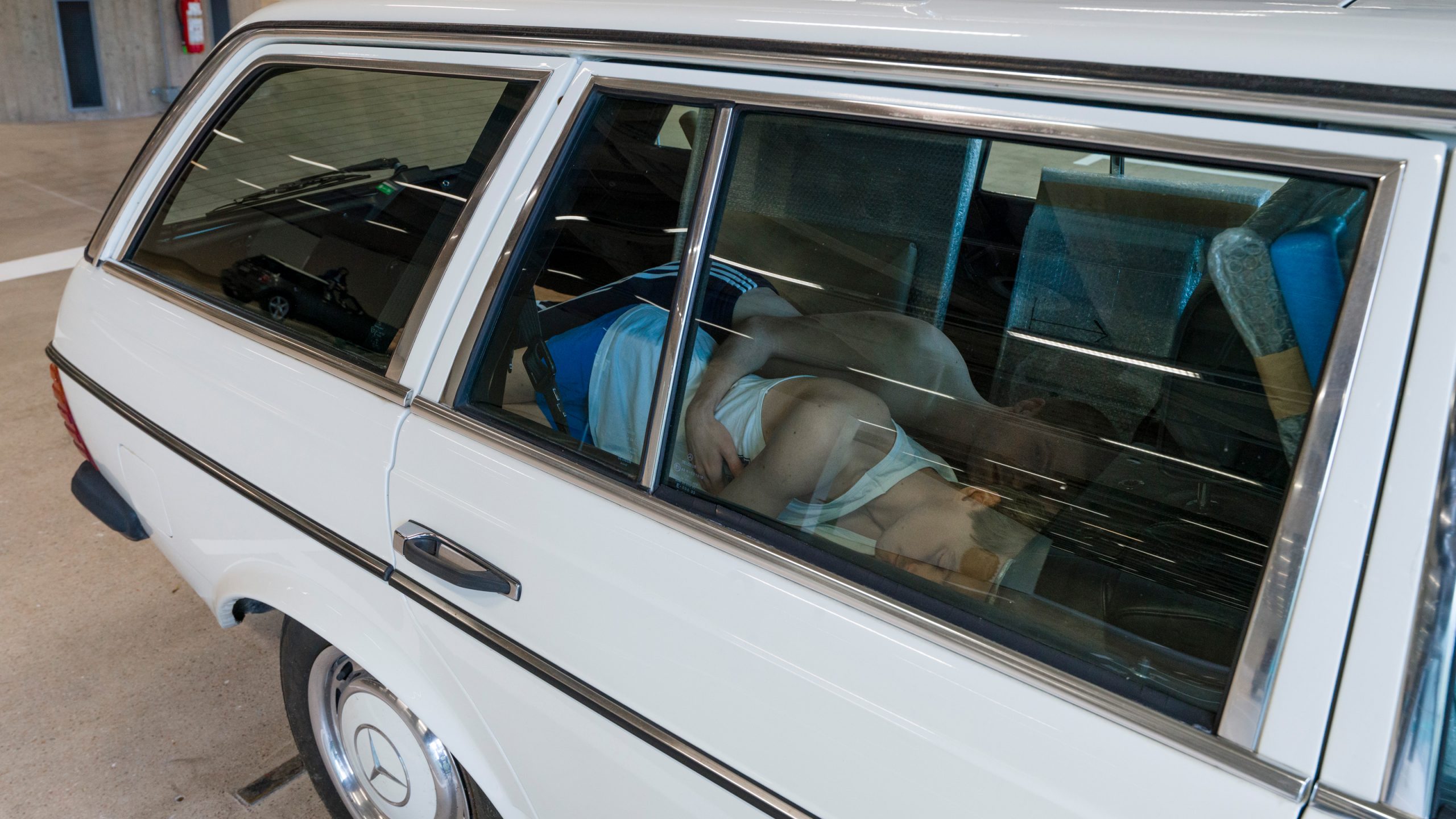
Elmgreen & Dragset: The Outsiders (detail), 2020 © Paula Virta / EMMA. Courtesy of Pace Gallery, New York and König Galerie
Cars have often been associated with gender issues. When we grew up in the 1970s, people in Scandinavia still referred to a smaller, cheaper car as a “housewife” car. Those were often the second car of the household. As Karen Lumsden explains in her book Boy Racer Culture (2013), the female driver was initially seen as integral to women’s liberation, but paradoxically, as the numbers of female drivers increased and became commonplace, the car became an extension of the home, a household tool that enabled women to complete domestic tasks such as shopping and picking up the kids at school more efficiently. As Lumsden sees it, the newfound mobility was further reinforcing and even expanding gender inequality (Lumsden, Karen, Boy Racer Culture: Youth Masculinity and Deviance, Routledge, 2013, pp. 13–14).
When we look at the overall car market even today, there is a big variety in the preferences of middle age women and men. According to one study by CBS News, “women tend to prefer non-luxury brands and are motivated to find vehicles that are affordable and known for their durability, reliability, and safety”, often resulting in the purchase of Asian brands which are knows for these qualities. Men are more likely to buy European luxury brands, considering “engine size, transmission type, drive train, and suspension specifications…high-end technology and stylish looks for both interior and exterior”. It is noted in the same report that the above gender differences do not apply to the millennial generation(s). Young women and men today approach the task of buying a car with similar considerations and confidence, with technical innovation, safety, fuel efficiency and practicality in urban spaces as key factors (source).
One car model that seems to have struck a chord with male and female car buyers all over the world for the past two decades is the Toyota Prius. It is a hybrid, meaning it uses both fossil fuel and electricity, pointing to both the past and to the future of the automobile industry. The modest Prius, a five-seater ordinary-looking car has, over the last twenty-three years, come to symbolise the pragmatic, eco-conscious driver’s choice. Unremarkable and unpretentious in appearance, performance and cost, this car has become remarkably popular: the most normal car of all cars. It lands firmly in the middle of the road in terms of economy, sustainability, quality and practicality. It’s the Levi’s of the motor industry, practically meeting the basic needs of everyday life.
In a new site-specific sculpture at EMMA, we have parked two Toyota Prius models side by side in neighbouring parking bays. Next to the cars, we have installed an industrial looking metal utility pipe that seems to protrude from the floor. The pipe rises to the height of the passenger windows on each side, turns and continues through both the cars’ open windows, anchoring the Toyotas to the ground. As a result, the cars almost become part of the fabric of the car park itself, absorbed into the infrastructure created for it. The ubiquitous Prius, seen everywhere moving in the streets, is now rendered static and denied its kinetic function in the motorised world. The Italian sociologist Gabriella Paolucci has noted that “The aspiration toward speed increases all the more strongly when the acceleration of everyday life is not satisfied, therefore creating an increase of discomfort and resentment. The symbolic power of speed thus creates a dynamic that curls in on itself, with no way out.” (Paolucci, Gabriella, “The Power of Speed and the Governance of Space in Urban Life”, in Alternative Takes to the City, Volume 5, eds. Micha, Irini and Vaiou, Dina, 2019, pp. 43 – 58) The constant craving for increased velocity must at some point lead to disillusion. Maybe our two “arrested” Priuses in their sudden surreal immobility with the ventilation pipe penetrating the cars seem to break this circle of evil?
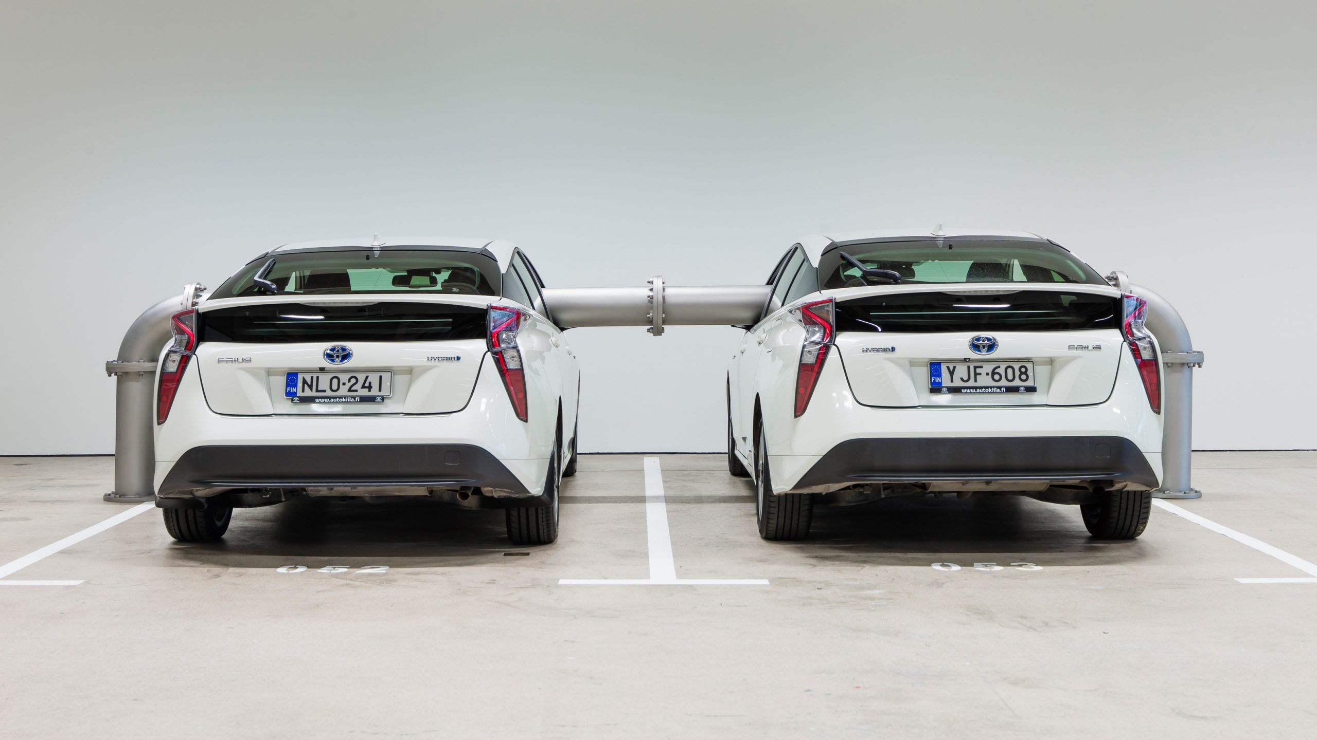
Elmgreen & Dragset: Die Ganze Familie, 2020 © Paula Virta / EMMA. Courtesy of Pace Gallery, New York
When One’s Favourite Park Is A Car Park
At the rear end of the exhibition, on an end wall, is a rotating advertisement board, a work of ours from 2006, which announces over and over again: “This Space Can’t Be Yours”. Which space is it that cannot be ours? Is it the actual space we are in? The metaphorical space of the parking garage? The space on the advertisement board itself? Or maybe the land of milk and honey we are frequently promised as we drive through our urban landscapes filled with billboards trying to tempt us into consuming ever more? We often get the feeling that public space itself is not there for us, for the actual public, stemming from the Latin word for people, populus. Private capital increasingly pays its way into our public spheres and reduces the space available for free use. In terms of urban semiotics, our minds seem to be accustomed to thinking that this limitation of our freedoms is natural, an inherent and unavoidable effect caused by the fiscally liberal society we have agreed to act within. The spaces where we are supposed to celebrate our togetherness as citizens – what we are left with when we finally move out of the digitalised realm – are largely transitional non-spaces such as supermarkets, airports or… car parks.
As the car park in the EMMA museum bends into a cul-de-sac, we have built a large metal mesh fence, with a gate above which the word “MIRACLE” is stencilled onto a signboard. If Miracle was a place that ever existed, the place appears to be in deep decline or even gone by now. The sign looks dilapidated and unloved. Like a premonition of a “nothing-good-is-gonna-come-out-of-this” shot in classic Western movie style, there is a vulture peering down from atop the signboard as we walk through. The 2014 work is called Rite de passage.
We could also have called it
THE END
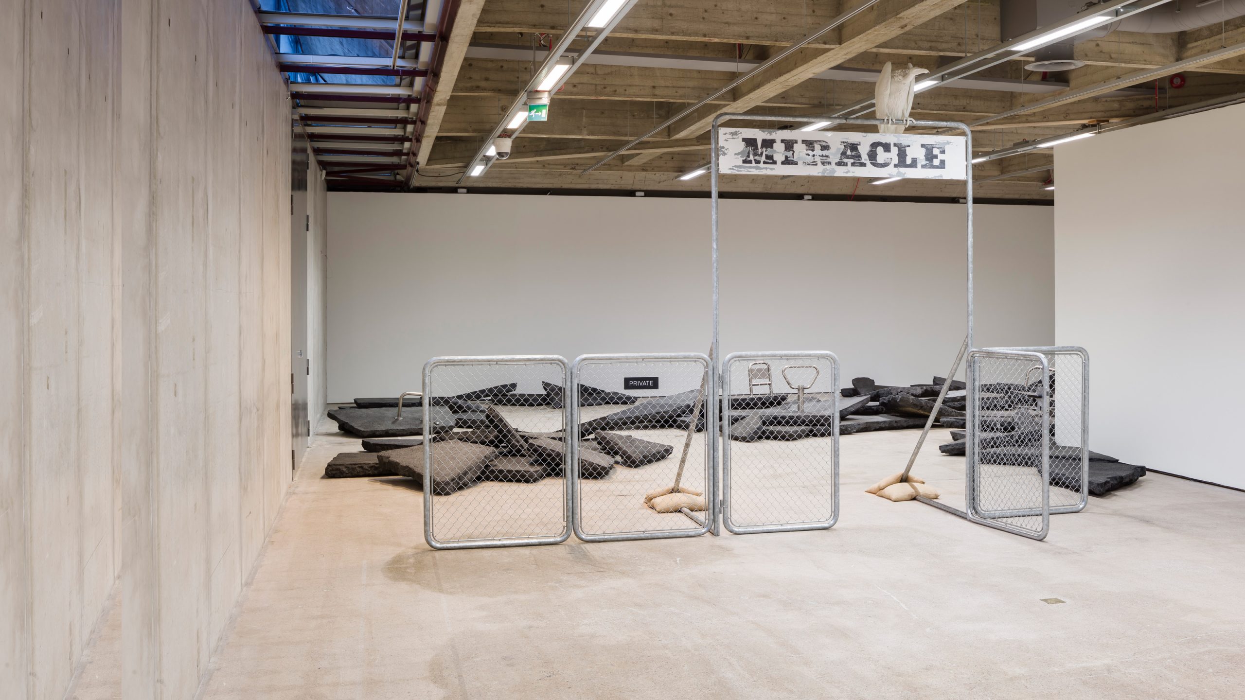
Elmgreen & Dragset: Rite of Passage, 2014. © Paula Virta / EMMA. Courtesy of the artists
